Understanding Bitcoin Candlestick Charts
Bitcoin candlestick charts are a vital tool for traders, offering a visual representation of price movements over a specific period. Developed in 18th-century Japan, these charts provide insights into market sentiment and potential trading opportunities.
Key Takeaways:
- Candlestick charts offer an intuitive way to understand market sentiment.
- They visualize bullish (upward) and bearish (downward) trends.
- Combine candlestick analysis with other technical indicators for informed decisions.
The Anatomy of a Bitcoin Candlestick
Each candlestick represents price activity within a defined timeframe (e.g., 1 hour, 1 day). It consists of a body and wicks (or shadows):
- Body: The range between the opening and closing prices. A green body indicates the closing price was higher than the opening price (bullish). A red body indicates the opposite (bearish).
- Wicks (Shadows): Thin lines extending above and below the body, representing the highest and lowest prices reached during the period.
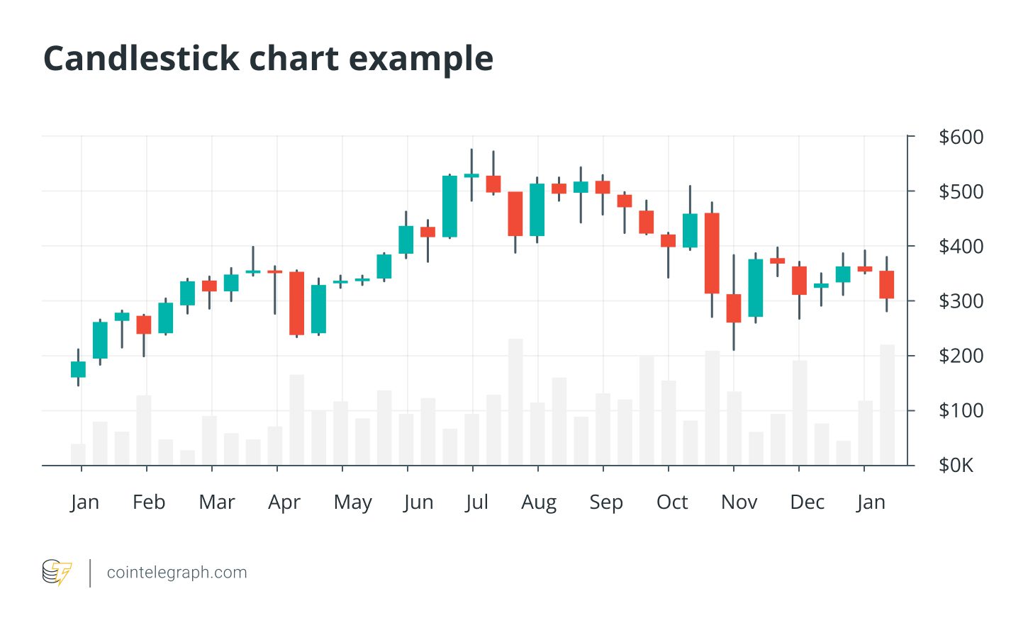
Reading a Candlestick Example:
Imagine analyzing a 4-hour Bitcoin chart. The opening price is $60,000, the closing price is $62,000, the highest price reached is $63,000, and the lowest is $59,000. The candlestick would have a green body extending from $60,000 to $62,000, with an upper wick reaching $63,000 and a lower wick dipping to $59,000.
Advantages of Using Candlestick Charts
- Visual Clarity: Quickly assess price movements and market sentiment.
- Timeframe Flexibility: Adapt to various trading styles (day trading, swing trading, long-term investing).
- Pattern Recognition: Identify potential reversals or continuations of trends.
Advanced Bitcoin Charting Techniques
Once you’re comfortable with the basics, explore these advanced techniques:
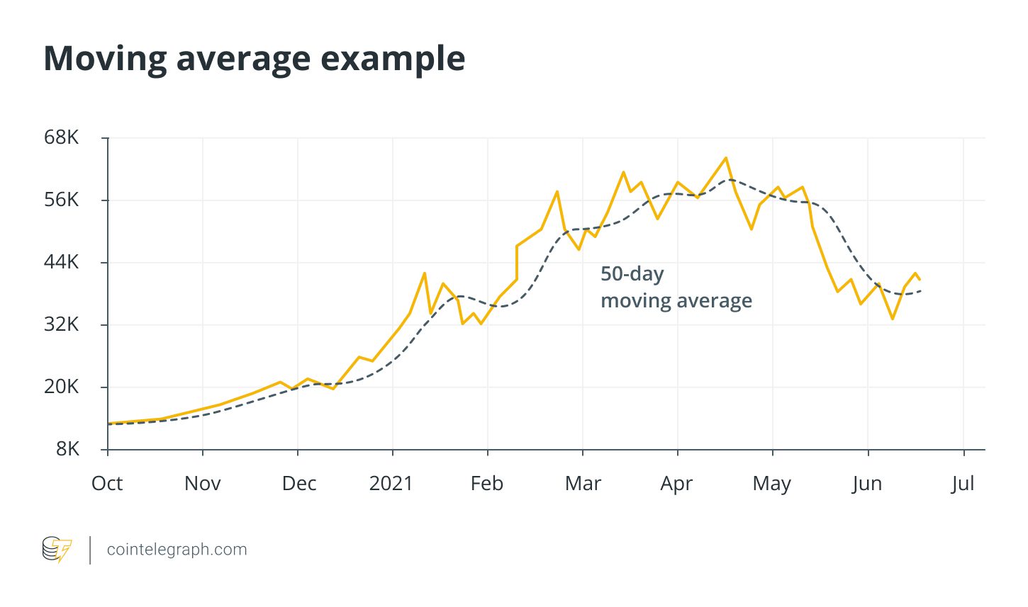
1. Moving Averages (MAs)
Moving averages smooth out price data to identify trends. Common types include:
- Simple Moving Average (SMA): Calculates the average price over a specific period.
- Exponential Moving Average (EMA): Gives more weight to recent prices, making it more responsive to new data.
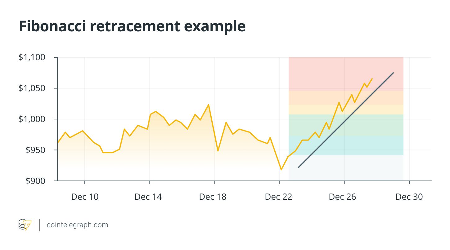
2. Fibonacci Retracement
This tool helps identify potential support and resistance levels by applying Fibonacci ratios to significant price swings. Key retracement levels include 23.6%, 38.2%, 50%, 61.8%, and 78.6%.
3. Relative Strength Index (RSI)
The RSI is a momentum oscillator that measures the speed and change of price movements. It ranges from 0 to 100. Values above 70 suggest overbought conditions (potential for a price decrease), while values below 30 indicate oversold conditions (potential for a price increase).
4. Volume Profile
Volume profile analyzes trading volume at different price levels, revealing areas of significant activity. These areas can act as strong support or resistance.
5. Elliott Wave Theory
This theory proposes that markets move in predictable patterns of waves, reflecting investor psychology. A typical Elliott Wave pattern consists of five impulse waves in the direction of the trend, followed by three corrective waves.
Important Considerations
- Candlestick charts are just one tool in your trading arsenal.
- Combine them with other technical indicators for confirmation.
- Always manage your risk and never invest more than you can afford to lose.
By understanding Bitcoin candlestick charts and incorporating them into a well-rounded trading strategy, you can improve your decision-making and navigate the crypto market with greater confidence.
This article does not contain investment advice or recommendations. Every investment and trading move involves risk, and readers should conduct their own research when making a decision.